Tuesday, 8 October 2013

The Games People Play

I really enjoy the challenge of being a graphic designer. Every client is so different and I often have to research to get a feel for the business. My aim is always to make my designs as appropriate and relevant as possible.

The Games People Play leaflet

In this case no research was required at all. As soon as I was given the brief I had an idea in my head. You may or may not know that I'm a bit of a board game fan.

That's why, I just knew that for advertising a board games event photographs of board game pieces or meeples would appeal to the target audience as well as be bright and colourful to stand out.

So I had a fun little afternoon in my studio photographing all sorts of board games and their meeples. The meeples from Carcassone, a popular euro game, stood out as clear winners. They gave me all the classic board game colours then I added in some hex shapes from board games like Settlers of Catan et voila!


So if you're around Stirling on the 9th of November pop into Common Ground Games, play some games and learn about social sciences. (http://www.stir.ac.uk/social-science/news/games/)

The Games People Play Leaflet

Thursday, 22 August 2013

Fife Society for the Blind

Once the new logos were in place for Fife Society for the Blind, the rest of the marketing materials had to be designed. The colour palette was based around the two colours of the logo. I added three more colours to add interest but always bearing in mind the contrast.


When it came to the banners for the three strands of the charity I decided to distinguish them by colour. The three main colours were allocated to the different strands but everything else about the banners looked identical.


Thursday, 15 August 2013

Introducing...Penelopi the Elephant

Fife Society for the Blind asked me to create an illustration for use on some  promotional materials as part of their rebrand. The inspiration for the elephant was an old collecting can they had which featured a pink elephant.

As the illustration was going to be printed on a tie and a scarf it had to be really simple but also include that all important striped t-shirt.

So here she is, the new charity mascot for Fife Society for the Blind.


 Look out for sightings of Penelopi if you're out and about around Fife!


Thursday, 1 August 2013

more academia

You may remember the academic poster I did a few years ago and you may be interested to know it's my most searched for post. It's a skill in itself representing large quantities of information in a visually appealing way.

After receiving many compliments about my hot air balloon poster I stuck to the same format when I was asked to design another one. This time the subject was volunteering and looked at urban and rural differences in participation.

The image of a plant poking through concrete represents both the urban and rural localities referenced in the paper.


If you're an academic or know any academics looking for a poster for a conference please get in touch to see if I can help.

Wednesday, 17 July 2013

Fife Society for the Blind

Special care has to be taken when designing for a charity working for the blind and visually impaired. There were several things that I had to bear in mind when working on the rebrand for the charity Fife Society for the Blind. Not only did I want the branding to look good but everything also had to be readable by the users.

Amongst other things I had to consider the colour contrast for the logo, the clarity of the typeface and the crop of the photos. Within the restrictions set it was no easy task to bring the look bang up to date.

All three branches of the charity were to look the same but with different names and taglines. The two-colour palette of blue and orange kept it simple but also striking. The logo can be used with and without the added taglines and the mark can also be used on its own making it very versatile.


Watch this space as I'll cover more on how the rebrand developed in further posts.

Tuesday, 9 July 2013

Child Survival in Malawi Scotland

I was very pleased when Child Survival in Malawi Scotland approached me for an update of their leaflet. The original leaflet was designed by me about 6 years ago while I was still a graphic design student.

While the leaflet looked pretty good and certainly better than anything they had previously there was a lot I had learned even in a few years of working in the industry.

This is how the cover looked in 2007 -

Child Survival in Malawi Scotland leaflet cover 2007

and now in 2013 -


Child Survival in Malawi Scotland leaflet cover 2013


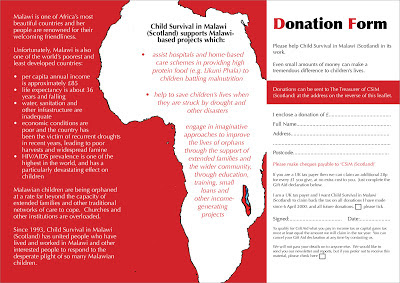
The page spread then (2007) -


Child Survival in Malawi Scotland leaflet spread 2007


and now (2013) -


Child Survival in Malawi Scotland leaflet spread 2013

The charity were delighted with their new leaflet " thank you most sincerely for all the excellent work you have done on our behalf on the new leaflet. We are delighted at your design and your speedy delivery".

Tuesday, 2 July 2013

The Willis Wood Brand

Sometimes a project comes together perfectly. This is the case when I was asked to create a brand for new forensic accountancy business, Willis Wood.

Fiona approached me fully prepared with plenty of ideas and a great strapline "A service tailored to you". I also teamed up with Abeoweb for the first time to create the website leaving me with more time to focus on the design side.

The logo had to be sophisticated and classy in order to appeal to the prospective clients - lawyers and accountants. I'd been wanting to use a serif typeface for a while but it had not seemed appropriate for any previous projects.

Willis Wood logo

I then used an enlarged version of the logo "pie-chart" to add interest to the business card, headed paper and website design.

Willis Wood brochure cover

The graphics took a slightly unusual route for the brochure and website. The tagline made me look closer at the tailored suits worn by the target audience. Photos of these representing the different areas gave the brand a modern yet sharp look with just a little bit of femininity.


Willis Wood brochure spread